From ATP: Geekbench Scores
One of my favorite podcasts is the Accidental Tech Podcast (ATP). In the weekly show, the hosts discuss tech news with particular emphasis on Apple news. While discussing the new iPad that was released in the fall of 2018, the hosts described Geekbench data how the iPad compared to laptops available at the same time. The take away from this discussion was this iPad was on par with many of the laptops available at the time, at a fraction of the cost. They provided a link to the Google Sheet they used as a basis for this discussion. While this analysis was sufficient to inform the hosts for a 15 minute conversation, I saw an opportunity to clarify the message in a single visual.
Starting: What is the question?
Every compelling visual answers a specific question or inform a specific decision process. I was lucky in this case because the question was stated by the hosts in the episode (quoting from their show notes):
How much does it cost to get a Mac that performs as well as an iPad Pro?
Put slightly differently, if processor performance and price are the only metrics that matter for your decision, how much can you save by buying an iPad Pro instead of buying a Mac.
By clarifying the question we have ruled out a lot of additional variables. One major potential variable could have been if the application you want to use is available on both MacOS and iOS. On top of that, the iPad has fewer ports, no permanently attached keyboard, etc. But for this discussion we are not concerned with these additional variables. The message of this visual is not which you should buy, but rather to illustrate how far iPads have come in being competitive with laptops.
What is Geekbench?
Understanding Geekbench is critical to understanding the graphic we are going to create. Put simply, Geekbench is a series of processor intensive tasks that generate a numeric score. This score can be used to compare different devices and configurations, but it is not a perfect measure of performance. Few users perfectly match the usage profile of Geekbench, and in some cases a device that scores better overall can be worse in the specific task you are trying to complete. For example in the podcast we learn that for compiler type tasks specifically the iPad Pro outperforms one model of iMac Pro (a much more expensive computer) with scores of 10,476 and 8,941 respectively. It is important to note that compiling on the iPad is very limited so this would not be a good buy if you need to compile regularly, but this is a great example of how boiling computer power down to one number is difficult.
Exploratory vs. Explanatory Analysis
One last point before I dig into the data. I think the hosts of ATP did a great job gathering the data and performing the analysis for the their purpose. They were able to discuss this for 15 minutes and clearly illustrate the situation over an audio medium. My goal is different and should not be taken as a critique of their work. I think this difference is covered by the difference between exploratory and explanatory analysis.
Exploratory Analysis: This analysis is to inform the analyzer about the data. Usually the analyzer is trying to learn what the data says. You may have the business questions in mind, but the main output is the analyzer better understanding the data and having a path forward for answering
Explanatory Analysis: This level of analysis occurs when the analyzer knows what the goal of the visualization is and the analysis is being crafted to clearly communicate that information to the audience.
ATP was looking for an exploratory analysis to assist with their episode. Once they understood the data they were done, the explanatory nature of the analysis came from their discussion rather than a more robust visual. My goal is to communicate similar information in a single visual.
The Initial Data
Taking a look at the Google Sheet we have 4 main visuals (click to enlarge).


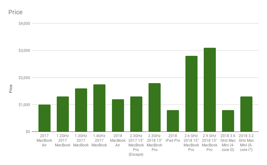

Looking that these we can see the the iPad Pro trends with the Pro level computers, but when we look at the price chart, the iPad is way lower than the comparable computers. So while this worked for the hosts to discuss there are several issues with these charts as answers to the question we identified earlier.
It is not clear where the iPad is without reading the labels (I would like my eye to be drawn to it)
Most readers see a line chart as data that is related from one data point to the next (ex. value over time). In this case the devices being discussed are not all part of a single line and displaying as a line chart is not the right tool for the job.
To answer the question, you have to look at 2+ charts.
So my goal is to take this data and communicate the question and the answer clearly and in one visual. I don’t want people to have to compare two charts to answer one question. But, it is also important that people don’t have to search for the answer, I want the reader’s eyes to be drawn to the answer while having more details to give depth to understanding if they want to spend more time with it.
My Visualizations
With that as the starting point and the data being in Google Sheets already I created the following visuals (click to enlarge).


I made both a single core and multi core chart, but as you can see, the result is the same. Only 3 devices have a higher Geekbench score in the sample provided. It is also clear that the cost to exceed the iPad Pro’s Geekbench is between $300 and almost $2,000.
These visuals communicate the question and answer in one visual and draw your eyes to the answer. The two things I think are missing here is making the delta a clear single number, and adding a caveat about the interpretation of Geekbench. So to do that I moved the data over to Excel.
What are the takeaways from this analysis?
First, not everything needs to be done to this level. The hosts at ATP had the data they needed at the level they needed to have their discussion. So, they were done, but this gave me an opening to dig into the data and re-listen to the discussion in an effort to make a single visual that communicated the same information as the segment of the podcast.
I could also make some changes to the colors. One benefit of red is that it grabs attention, but the downside is it can communicate negativity to a western audience (I believe green has a more negative connotation to some eastern audiences). So if I found that the colors were an issue for my audience I could find a different pallet to accomplish a similar goal. Another clarify note is that I removed some of the data points to reduce overlap of the labels in the multi-core chart. I need to make that clear in case the data points I dropped are relevant to the audience.
Finally, since the data came from Google Sheets I wanted to use it for this analysis. I had to do some interesting hacks to get the vertical lines (they are actually just very steep slopes to approximate vertical lines). Another issue is that Google Sheets have more limited axis and grid options. It worked out in the end, but I do appreciate the flexibility tools like Excel and Tableau have to really design your visuals exactly as you want.
Tool: Google Sheets
Update: A version of this chart in Excel addressing some of the above points.